Fractal Audio Systems mystery product speculation

What is it not it is? Is it?

  • None of the above

  • Electric sex pants

  • Unsliced Bread

  • JiveTurkey's resolve to "innovate" with audio signal routing

  • Lab grown "safe & guilt-free" toe meat


Results are only viewable after voting.
Status
Not open for further replies.
Genuine, good-faith question about this awesome array of amps.

I took my Supro Keeley Custom 12 combo to the church yesterday to practice for an upcoming performance. I have a Helix patch that's basically a pedal board that splits via effects-loop-send to the amp after the effects, and then the signal path continues to a tone-matched Helix amp model that goes to FOH. I also put one of my ""FRFR"" wedges monitors on stage too for stereo fun.

I turned the Supro up to 10 o'clock, and it was deafening, it filled the entire hall loudly, and when I turned on my ""FRFR"" wedge it couldn't keep up at all. The amp also had a nicer sound especially at this volume, but the wedge was less directional.

How do you deal with this kind of wattage and speaker surface area? I literally can't imagine how it works in real life. My 112 was easily over 100dB.
There have been very few gigs where I was told to turn down. I generally turn up so I'm just a touch louder than the drummer. But bear in mind the bands I play in are post-rock/post-metal bands. These have been loud (but dynamic!) drummers, bassist, two guitars, synths, vocals.

In that sort of thing there's a requirement for a lot of clean headroom, which is why I love 100-watt amps versus stuff in the 10-40watt range. I find their power sections breakup too quickly for my tastes. I do love the 50-watt 5150III amps though, those are great.

At home, I am very lucky to be able to play through a 4x12 and not really have too many complaints. I try not to take the piss. But my wife is very encouraging and understanding, never gives me any of the "you're too loud" shit, and I've actually blocked off a window with some rockwool panels to help the neighbour avoid the noise. She's the pain point really, because she's an old lady with hearing aids. So again, I genuinely try not to take the piss.

Other times I'll plug one of them into a Suhr loadbox and route that into Cab Lab 4 or something. It really depends. I don't play all of the amps all the time. I chop and change based on my tastes at the time. My favourite ones are the Dual Rectifier, VH4, JVMJS, and a 6505+ that isn't in that picture. The Hagen is really fucking cool too!
That makes sense.

I really like post-rock too, the Supro is pretty clean and I tend to use strats with the volume rolled down a bit which helps. For P&W tones that bit of break-up I get suits the sound.

At home I'm semi-detached, and for volumes that are sensible I get better results using the Helix and my Yamaha HS8s than trying to use the amp.

One of these days I'm hoping I'll have a chance to crank a 100w 412, but I haven't had it yet. I have cranked a Fender DeVille 212 and that was earth-shattering even at 9 o'clock, so I can still only imagine!
o_O
 
In the spirit of this threads trajectory ..... I feel it is imperative that I let everyone know ..... I like Cup Cakes with real cream inside them.

An I mean actual real cream like the Brits and Aussies make ..... not that whatever the f&ck white sh%t that gets sprayed out of a can in the US !!!! You can mess with my gear choices, but dont f%ck with Cup Cakes and Real Cream !!!!!

Just keeping everyone's eyes on the main focus :)

Ben
 
The reality is that when you pack that much functionality into a single device, creating an intuitive and straightforward user interface becomes exponentially more challenging. Every parameter, every feature has to be accessible, but balancing that with ease of use is like walking a tightrope.

Compromise.

Only the standard controls and routing can be accessed via the screen. You wanna dig into the advanced shit you gotta use Axe Edit.
I don't think anyone should expect to get into real world amp tech type adjustments via a touchscreen.
And for the majority (assuming) who don't spend a lot of time in the deep end, the touch screen would get them by.

Take it as far as the Quad Cortex goes on the unit and then leave the rest to the PC editor.
Okay. How many pages do you want? You can have 5 parameters per page. Which ones do you want for amp, cab, reverb, delay, phaser, etc...

Go on. Design something. I dare you.
 
Okay. How many pages do you want? You can have 5 parameters per page. Which ones do you want for amp, cab, reverb, delay, phaser, etc...

Go on. Design something. I dare you.

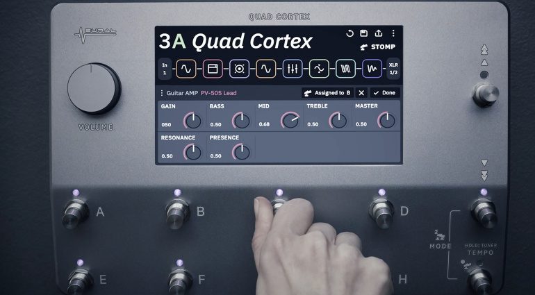
Ever used a Cortex? Create the preset with drag and drop then make the basic adjustments (same as you'd have on a pedal or amp)
via the screen.

neural-dsp-quad-cortex-floor-modeller-770x425-1.jpg
 
Ever used a Cortex. Create the preset with drag and drop then make the basic adjustments (same as you'd have on a pedal or amp)
are via the screen.

neural-dsp-quad-cortex-floor-modeller-770x425-1.jpg
Yes I owned one. I thought it was a pretty poor experience on the whole.

- Disconnect between the poo-knobs and the on screen knobs means that the eye is always flitting back and forth between the two areas, causing momentary confusion which affects workflow.
- Difficult to read the screen when standing above it, and from various angles the readability would change significantly.
- Lots of "off screen" parameters that you don't know about unless you read manuals or watch tutorial videos, which a lot of people don't.
- The touchscreen itself is very unresponsive. Nowhere near the quality of an iPad or Pixel phone.
- Most of their colour scheme and routing mechanics were lifted straight from Helix wholesale.
- The amp models themselves sounded pretty average, not standing up to an a/b comparison with my Axe FX III (I owned them side by side for 3 months)
- The cab section was fiddly to use.
- The knob values don't mean anything. 0.5 on a resonance control doesn't tell me anything and is not analogous to anything we experience in the real world. It would have been better to use a 1-10 scheme. Easier to remember when you want to build a patch from scratch.
- The whole file browsing and cloud connectivity side of things is UTTERLY ATROCIOUS.
 
Compromise.

Only the standard controls and routing can be accessed via the screen. You wanna dig into the advanced shit you gotta use Axe Edit.
I don't think anyone should expect to get into real world amp tech type adjustments via a touchscreen.
And for the majority (assuming) who don't spend a lot of time in the deep end, the touch screen would get them by.

Take it as far as the Quad Cortex goes on the unit and then leave the rest to the PC editor.
TC toneprints are a good example of this approach, you have a few main parameters to tweak on the pedals but you find all advanced parameters on the app.

But that's not necessary on the Fractal on-board UI imho, all that is needed is that the default page when you access the block is the one with the main controls (like it is now for some blocks, needs some parameters reorganization on other blocks) and by paging left or right you either access the model selection or the advanced parameters.
 
Yes I owned one. I thought it was a pretty poor experience on the whole.

- Disconnect between the poo-knobs and the on screen knobs means that the eye is always flitting back and forth between the two areas, causing momentary confusion which affects workflow.
- Difficult to read the screen when standing above it, and from various angles the readability would change significantly.
- Lots of "off screen" parameters that you don't know about unless you read manuals or watch tutorial videos, which a lot of people don't.
- The touchscreen itself is very unresponsive. Nowhere near the quality of an iPad or Pixel phone.
- Most of their colour scheme and routing mechanics were lifted straight from Helix wholesale.
- The amp models themselves sounded pretty average, not standing up to an a/b comparison with my Axe FX III (I owned them side by side for 3 months)
- The cab section was fiddly to use.
- The knob values don't mean anything. 0.5 on a resonance control doesn't tell me anything and is not analogous to anything we experience in the real world. It would have been better to use a 1-10 scheme. Easier to remember when you want to build a patch from scratch.
- The whole file browsing and cloud connectivity side of things is UTTERLY ATROCIOUS.
Angry Season 4 GIF by The Office
 
And I'd reiterate my point. When your product ends up having as much functionality and as many exposed parameters and as much flexibility as the Axe3 does, you're always going to have a challenge making the thing easy and intuitive to use.

The reality is that when you pack that much functionality into a single device, creating an intuitive and straightforward user interface becomes exponentially more challenging. Every parameter, every feature has to be accessible, but balancing that with ease of use is like walking a tightrope. It’s incredibly difficult to design something that’s both feature-rich and user-friendly, especially in a professional-grade product like the Axe-FX III, where users expect a high degree of control over every aspect of their sound.
I agree with all of this 1000%, but IMO it supports the need to advance the FAS UI design in the wake of years and years of additions and improvements to the underlying functionality. I honestly cannot even grasp how this manages to be a debate. Nobody is saying the UI should revamped in an effort to make it shittier.

And on that same note, I can't fathom where TF this came from:
Somebody can't read, can't understand, and can't parse anything external to their own viewpoint.
smiling-man-looking-in-bathroom-mirror-CVF00947.jpg


You said (yes, among other things):
With Fractal, I know I can design a delay tone that I have in my head. With other brands I know I am limited to the 4-10 parameters that they think I should be allowed to access. With other brands I know that if their digital delay sounds a certain way, or decays away at a certain rate, that I'm stuck with it. Whereas with Fractal I know I can mess with the EQ, the compander, the drive, and I can craft a delay tone that is exactly what I wanted. The downside of that is, I know it is going to take some time. I also know if I want to tweak it in the middle of a show, that it isn't going to be easy.

But I'd rather that that not be able to do it at all, or just be stuck with effect X on another platform.
All I'm saying is that any number of parameters relating to a given device block can be paginated or arranged in a scrolling view - preferably in a sensible order so that more frequently used parameters are visible first. Most of the major players, including FAS, are already doing this. The flexibility of the device blocks, as measured in number/ variety/ depth of parameters, does not preclude improvements to other aspects of the user experience. No one is suggesting that FAS should improve their GUI by eliminating parameters or otherwise dumbing down their devices.
 
So then, plenty of areas for Fractal to improve upon when they do theirs.

* Most folk's experience with the QC screen are really good. I think you may be biased. :giggle:
I'm probably one of the few people here who doesn't have a bias.
 
And on that same note, I can't fathom where TF this came from:
Go back and read your comment here:

It is pretty self evident. I wrote a fully detailed comment dealing with multiple topics, and you chose to reduce it to me saying "MuH pArAmEtErS!"

Pfft.
 
Status
Not open for further replies.
Back
Top