Digital Igloo (Eric Klein, YGG)

Not pushing back at all, just trying to absorb a bit more context if you don't mind.

Spider Valve (top) had a metal faceplate, like the Revv (2nd) and Friedman (3rd). DT50 (bottom) had a thick plexiglass faceplate so the active channel's tonestack labels could be backlit; is that the aesthetic concern? To my aging eyes, DT50 appears way closer to the Friedman than it does Spider Valve, logos notwithstanding. Maybe I'm missing something else?

This is an interesting conversation; thanks!
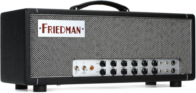
View attachment 41884
For sure! I'm happy to share my opinion to anyone who's willing to listen ha. Fully aware we're in nitpicking territory here, but I think these kinds of "first visual impressions" are useful.

If I was to go off first impressions of these pictures:

- Spider Valve looks kind of Bugera-ish. I bit like a mishmash of different designs forged together. Could probably look smarter with some small tweaks but as is, it looks the "cheapest" of the four.

- I'd say the Rev looks more like a Line 6 amp than it does a boutique amp. Probably down to the number of knobs, the fonts, the type of knob used, headphone output on the front panel. Tolex looks nice, but there's a lack of nice flourishes (no piping, plain corner protectors) - very plain/generic/functional in how it looks.

- JJ100 is maybe not my favourite looking Friedman, but it's a good example to use. Headcab looks nicer than the Revv with the rounded corners, gold piping, gold font. Caveman number of knobs makes it more inviting and straightforward to someone who hasn't used one before, and they won't immediately think "digital".

- DT50. Headcab looks great - I love the rolled edges, gold piping, handle, feet. Could just be the image, but the texture of the tolex doesn't quite look as nice as the Friedman or Revv. Not sure it would bother me, but for comparisons sake it looks a bit different. Faceplate is where it looks a like it's another amp that's been placed in a nice head cab. In a lot of ways, it looks better to me than the Revv, but I think it would look even more slick if the faceplate was less congested, if the knobs looked more like what you'd find on an older amp, if the font (and font colour) matched the piping. Cramming the pilot light wherever it'll fit, and using the same style of switch for power/standby/channels/poweramp modes etc doesn't fully vibe with me. Feels a bit like the headcab is an off the shelf one, and the chassis/faceplate have been forced to fit inside it (rather than both being designed together). I could probably forgive most of these faceplate comments if the font and knobs were different, though.

I've been trying to think of what other amps it reminds me of, where it's ALMOST there but something gives it away. Egnater might be a good example - to the average guitarist it might look pretty close to an expensive Bogner or Friedman or Suhr but in person they just feel a little off.

Headcab is OK, is many ways I think the DT50 is nicer, but the Egnater has a few nice cosmetic things. The faceplate looks crap though and drags the aesthetic down to me.

1744399186320.png


Strangely I think the Vengeance looks more expensive, albeit less "boutique" - with more controls, having the faceplate take up the full width of the chassis looks like a coherent design choice. The fonts are daft, but as a whole it works. Things are spread out nicely, nice knobs being used, a lot on there but doesn't feel too busy or cramped. Despite both being valve amps, just based on how they look, I'd assume the tweaker is a budget hybrid/digital amp, and the Vengeance is some kind of flagship.

1744399328374.png


Gotta say, I think the DT 4x12 cabinet (big badge aside) looks fantastic. The colours work really well, and it's simple/elegant enough that it looks high end (track lock castors AND chunky feet, nice handles all excellent choices). Nitpicking, but big ass Line 6 logos and that amp faceplate distract for me. The Line 6 logo really makes it hard for me not to think Vetta/Flextone/Spider etc too, very hard to do anything about that but it does influence.

1744399683759.png


In writing this, I've been trying to think about what it is that makes a good looking amp. I think the more it looks like it was created by a human being pouring their love into it, and less like it got mass produced by a machine, the better. Small bespoke touches (using different types of switches depending on function) is good. Using consistent colours and visuals between faceplate and head cab make it look like no expense was spared and it was all designed together:

1744400178819.png
1744400091890.png
1744400028325.png


Its also been quite interesting to see how some expensive amps REALLY don't look much like expensive amps to me (Two Rock, Matchless), but also how amps like the Tweaker (or say Albion/Subzero/Harley Benton/Bugera/etc) just instantly look very budget.
 

Attachments

  • 1744399976503.png
    1744399976503.png
    1.2 MB · Views: 2
$50-75 end user cost? Probably not. It's one of those things where if you're going to improve one thing, and that thing pushes you clear out of a particular price point, you should probably improve additional things and embrace a completely different price point (and perhaps pivot your marketing and/or target customer).
This logic actually lead me to buying the Helix instead of building my own pedal board. I didn’t need everything the HX Stomp/Helix offered, but once I started to factor in the costs for everything beyond the pedals themselves, it made sense for me to jump into those products. Of course, after getting them I don’t want to live without the routing/snapshot/command center convenience ever again.

I don’t know how that translates to the amp world though when so much of why we pay a lot of money for an amp is for things like “mojo” “kerang” “tube warmth” and the power of big iron. If features were the reason we pay for amps, Fender would be out of the amp business.
 
For sure! I'm happy to share my opinion to anyone who's willing to listen ha. Fully aware we're in nitpicking territory here, but I think these kinds of "first visual impressions" are useful.

If I was to go off first impressions of these pictures:

- Spider Valve looks kind of Bugera-ish. I bit like a mishmash of different designs forged together. Could probably look smarter with some small tweaks but as is, it looks the "cheapest" of the four.

- I'd say the Rev looks more like a Line 6 amp than it does a boutique amp. Probably down to the number of knobs, the fonts, the type of knob used, headphone output on the front panel. Tolex looks nice, but there's a lack of nice flourishes (no piping, plain corner protectors) - very plain/generic/functional in how it looks.

- JJ100 is maybe not my favourite looking Friedman, but it's a good example to use. Headcab looks nicer than the Revv with the rounded corners, gold piping, gold font. Caveman number of knobs makes it more inviting and straightforward to someone who hasn't used one before, and they won't immediately think "digital".

- DT50. Headcab looks great - I love the rolled edges, gold piping, handle, feet. Could just be the image, but the texture of the tolex doesn't quite look as nice as the Friedman or Revv. Not sure it would bother me, but for comparisons sake it looks a bit different. Faceplate is where it looks a like it's another amp that's been placed in a nice head cab. In a lot of ways, it looks better to me than the Revv, but I think it would look even more slick if the faceplate was less congested, if the knobs looked more like what you'd find on an older amp, if the font (and font colour) matched the piping. Cramming the pilot light wherever it'll fit, and using the same style of switch for power/standby/channels/poweramp modes etc doesn't fully vibe with me. Feels a bit like the headcab is an off the shelf one, and the chassis/faceplate have been forced to fit inside it (rather than both being designed together). I could probably forgive most of these faceplate comments if the font and knobs were different, though.

I've been trying to think of what other amps it reminds me of, where it's ALMOST there but something gives it away. Egnater might be a good example - to the average guitarist it might look pretty close to an expensive Bogner or Friedman or Suhr but in person they just feel a little off.

Headcab is OK, is many ways I think the DT50 is nicer, but the Egnater has a few nice cosmetic things. The faceplate looks crap though and drags the aesthetic down to me.

View attachment 41885

Strangely I think the Vengeance looks more expensive, albeit less "boutique" - with more controls, having the faceplate take up the full width of the chassis looks like a coherent design choice. The fonts are daft, but as a whole it works. Things are spread out nicely, nice knobs being used, a lot on there but doesn't feel too busy or cramped. Despite both being valve amps, just based on how they look, I'd assume the tweaker is a budget hybrid/digital amp, and the Vengeance is some kind of flagship.

View attachment 41886

Gotta say, I think the DT 4x12 cabinet (big badge aside) looks fantastic. The colours work really well, and it's simple/elegant enough that it looks high end (track lock castors AND chunky feet, nice handles all excellent choices). Nitpicking, but big ass Line 6 logos and that amp faceplate distract for me. The Line 6 logo really makes it hard for me not to think Vetta/Flextone/Spider etc too, very hard to do anything about that but it does influence.

View attachment 41887

In writing this, I've been trying to think about what it is that makes a good looking amp. I think the more it looks like it was created by a human being pouring their love into it, and less like it got mass produced by a machine, the better. Small bespoke touches (using different types of switches depending on function) is good. Using consistent colours and visuals between faceplate and head cab make it look like no expense was spared and it was all designed together:

View attachment 41891View attachment 41890View attachment 41889

Its also been quite interesting to see how some expensive amps REALLY don't look much like expensive amps to me (Two Rock, Matchless), but also how amps like the Tweaker (or say Albion/Subzero/Harley Benton/Bugera/etc) just instantly look very budget.
Cool; thanks! Yeah, this all gets pretty subjective after a while.

My main takeaway here is that any higher end/boutique amp we might dream up—no matter how great it sounds or nice it looks—might have its desirability (and certainly its expected street price) dragged down a notch simply by sporting a Line 6 badge. Let's just say... none of this is surprising, and we talk about this a lot.

Just another reason why there's no Helix amp.
I can certainly believe it, which is a shame but it’s also a sign of your success at making great products affordable to basically everyone.

It would be interesting to see the tech licensed to amp brands (either officially or behind the scenes). Given the way the wind is blowing with amp companies making digital amps, I’d much rather they called in experts who’ve been doing it for years than starting it all from scratch.

Orange/Diezel/Revv/Bogner/Soldano/Matchless etc would be quite interesting to me to do a kind of “powered by Line 6” hybrid that combined some fx and modelling with whatever the amp companies spec up.
 
For sure! I'm happy to share my opinion to anyone who's willing to listen ha. Fully aware we're in nitpicking territory here, but I think these kinds of "first visual impressions" are useful.
Speaking of Egnater, I think the Tourmaster was one of their better visual designs. It's not an expensive amp, but I feel like it looked a bit more expensive than it was. Like you could put that in the same room with eg. a Marshall JVM (which in Europe is not that expensive either) level stuff.

2f9e3fd0dcro8BWKHhXARc6CZPLHNdVbnhVMW9Qy.wm-dw.jpg


I don't love that cream tolex, but as a design it's quite consistent and distinctive to stand out from the sea of black amps. Ahead of its time in terms of features with it's multiple near identical channels, power scaling matrix etc.

Its also been quite interesting to see how some expensive amps REALLY don't look much like expensive amps to me (Two Rock, Matchless), but also how amps like the Tweaker (or say Albion/Subzero/Harley Benton/Bugera/etc) just instantly look very budget.
Yeah even brands like Mesa can be weirdly inconsistent.

Boutique:

3Mesa_Boogie_Mark_VII_Quilted_Mahogany_00.jpg

The vibe is kind of like an old hifi system with the figured wood chassis, wicker etc.

Expensive:

mesa_boogie_lonestar_avaus.jpg

It looks like "gear used by a pro". Just having that blue color gives it a bit of character. It sucks that they just went with gray and black for newer iterations of this amp.

Affordable:

royal_atlantic_ra_100_format_head_front_highres.jpg

The overengineered looking front makes it look cheap. I think this would be way better without that grille cutout, just plain tolexed front. Quick Photoshop:

Screenshot 2025-04-12 at 13.16.31.png


Cheap:

2a539c6c3c0FV9DiLWFgvEVPGrqQqvxVU0GiU1yl.jpg


Whoever designed the visual look of this deserved to be fired. It's just so damn ugly, from the materials to whatever "car parts" thing they were trying to evoke.
 
Cool; thanks! Yeah, this all gets pretty subjective after a while.

My main takeaway here is that any higher end/boutique amp we might dream up—no matter how great it sounds or nice it looks—might have its desirability (and certainly its expected street price) dragged down a notch simply by sporting a Line 6 badge. Let's just say... none of this is surprising, and we talk about this a lot.

Just another reason why there's no Helix amp.
Just start an amp brand called “Cartographer”, limit your amps to 2 models and reverb, and don’t tell anyone.
 
When I saw the pic of Mesa TA-15 Transatlantic amp above, I could hear the following in Peter Griffin's voice:

"Robots in disguise."

It must sound good being a tube amp, but the look..

Yes, I love transformers.
 
Back
Top